Artificial Intelligence
Simple Steps for Data Preparation & Exploratory Data Analysis
June 29, 2023
11 min read


Exploratory Data Analysis and Data Preparation are the most important tasks you need to do to ensure you get the best model. Your deep learning, machine learning, or data science projects start with preparation.
Like automotive painting, preparation is 80% of the job in getting the best results. Otherwise, our models will become inaccurate, fragmented, and overall lower quality than desired. The last 10-15% is polishing and fine-tuning to hone our models.
We will focus on exploring, understanding, and preparing your data to find underlying attributes, outliers and anomalies, and patterns and correlations before feeding it to your model.
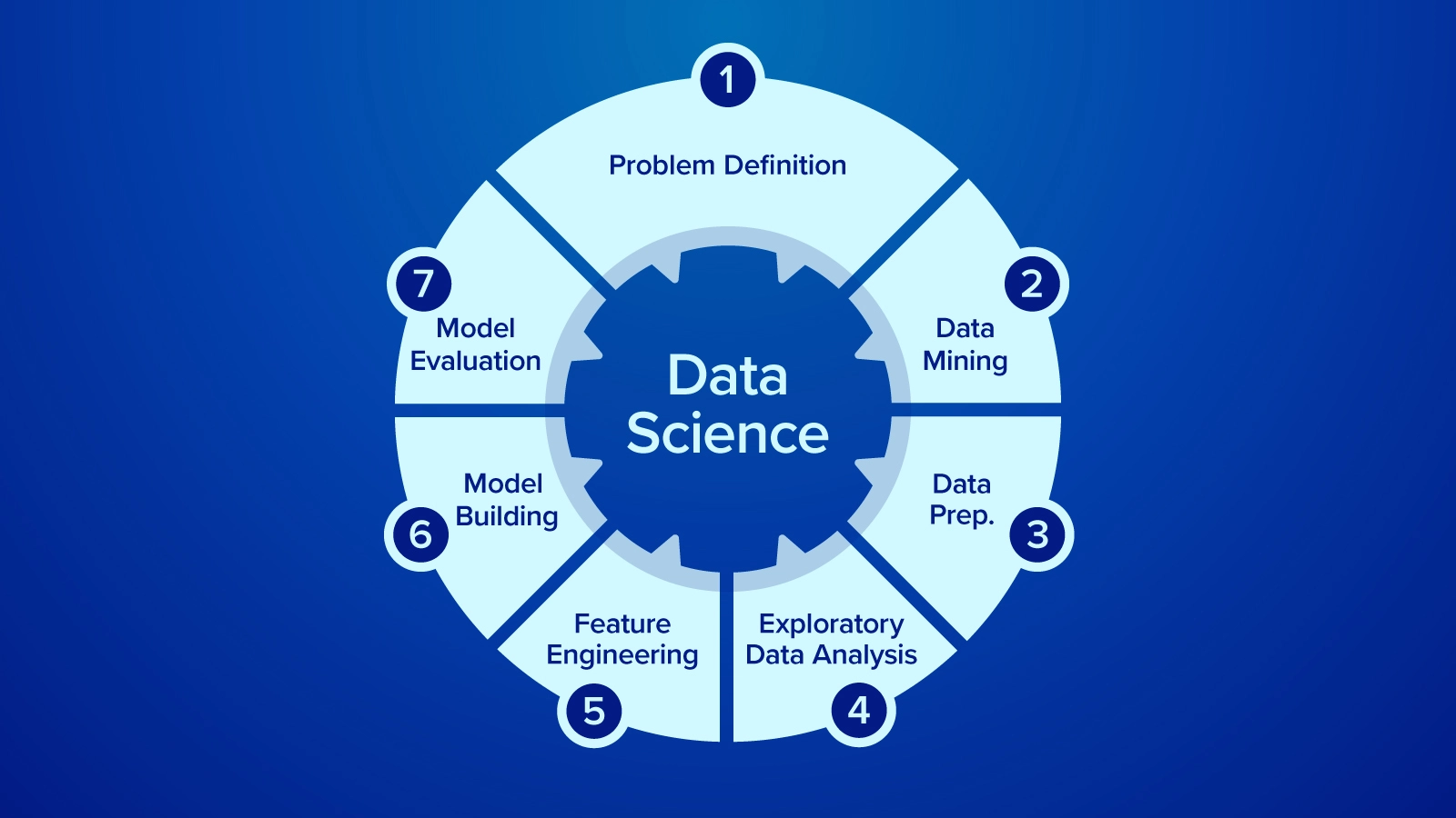
Exploratory Data Analysis is a process used by data scientists and machine learning researchers to analyze, investigate, and understand the dataset using visualization tools. EDA can reveal patterns, relationships, correlations, as well as biases, outliers, and invalid data points to clean, prepare, and analyze data for feature engineering.
Exploratory Data Analysis and Data Preparation go hand in hand in our opinion. Yes, EDA can be a standalone method for discovering and understanding your data but can supplement your data preparation making it easier to clean your data. Use EDA during or after your Data Preparation step. Here is a short run down as to what to focus on when preparing your data.
Evaluating the problem and defining the goal of the model may sound trivial, but it is an essential process that is overlooked. You might have all this data but without the right questions to ask, there are no answers. A clear and well-defined object for the project directs the project for more informed decisions on data preparation, analysis, and feature engineering.
Say you wanted to determine flight delay reasoning based on time, departure location, arrival location, distance, airline, and other variables. If your goal is to have a very easy-to-digest model with clearly defined reasons as to why a flight might be delayed, you could opt for a binary decision tree.
If you want to just predict a new flight’s delayed reasoning, neural networks can deliver results in evaluating underlying relationships to provide a more accurate hypothesis. Neural Networks are the beating hearts of AI, but it is difficult to look under the hood as to why the model is choosing one weight over the other.
Of course, the best way to understand your data is to gather the data yourself but this is not always the case. Sometimes you receive the data as a freelance data analyst or you’re evaluating a dataset you found on Hugging Face to practice. Your expertise might not always be in that dataset, so receiving any guide as to how the data is organized is important.
Data is often organized in a table like a json or csv. Use tools like Pandas to view the table data frame and examine the data. Sometimes these columns might be named obscurely so find out what each variable represents. Feeling out the data and understanding what each column represents to your problem will drive you immediately to the next step.
Now that you have your goal and you understand your data, the next step is to manipulate your data to answer your overarching question. Data Cleaning and Preparation starts with a couple simple steps:
All data is important data but for intents and purposes, introducing variables that are not impactful to the model can skew it in an undesirable direction. When you train your model, you might have access to more data than when you collect data in real-time. Some variables can be irrelevant which can be removed to keep your data table clean, tidy, and purposeful.
Consider the previous example for Flights and we want to predict flight delay reasoning:
import pandas as pd
import numpy as pd

flights = pd.read_csv('flights_sampled.csv')
flights.columns

Index(['YEAR', 'MONTH', 'DAY', 'DAY_OF_WEEK', 'AIRLINE', 'FLIGHT_NUMBER',
       'TAIL_NUMBER', 'ORIGIN_AIRPORT', 'DESTINATION_AIRPORT',
       'SCHEDULED_DEPARTURE', 'DEPARTURE_TIME', 'DEPARTURE_DELAY', 'TAXI_OUT',
       'WHEELS_OFF', 'SCHEDULED_TIME', 'ELAPSED_TIME', 'AIR_TIME', 'DISTANCE',
       'WHEELS_ON', 'TAXI_IN', 'SCHEDULED_ARRIVAL', 'ARRIVAL_TIME',
       'ARRIVAL_DELAY', 'DIVERTED', 'CANCELLED', 'CANCELLATION_REASON',
       'AIR_SYSTEM_DELAY', 'SECURITY_DELAY', 'AIRLINE_DELAY',
       'LATE_AIRCRAFT_DELAY', 'WEATHER_DELAY'],
      dtype='object')
We won’t need variables that have nothing to do with the flight delay reason itself like WHEELS_ON, WHEELS_OFF, TAXI_IN, and TAXI_OUT. We can also determine some variables that you can omit since they are unneeded redundancy like AIR_TIME and TAIL_NUMBER. You can find this dataset here on Kaggle.
Missing values can be a result of input error. Check to see if the errors make a significant dent in your entire dataset. If there are minimal errors, you can save some time by just taking those data points out. If you see a recurring theme for these errors, this might be an underlying cause that needs to be addressed outside your project. It is best to feed our model the cleanest and most comprehensive data to prevent any unwanted outcomes.
When reading CSV file formats using Pandas, it shows as ‘NaN' meaning the field is empty. You may have to infer what these NaN cells represent: if Delay Time cells have NaN, then you can replace these values with 0 as there is no delay.
Don’t think that all outliers are bad. Outliers can sometimes be representative of the data. Verify if these outliers are plausible as well as evaluate whether it is or is not detrimental to your system. Visualization can aid in identifying outliers and histograms are a great way to map out the range of the data:
flights.hist(bins=60, figsize=(20,20))

array([[<AxesSubplot:title={'center':'YEAR'}>,
        <AxesSubplot:title={'center':'MONTH'}>,
        <AxesSubplot:title={'center':'DAY'}>,
        <AxesSubplot:title={'center':'DAY_OF_WEEK'}>],
       [<AxesSubplot:title={'center':'FLIGHT_NUMBER'}>,
        <AxesSubplot:title={'center':'SCHEDULED_DEPARTURE'}>,
        <AxesSubplot:title={'center':'DEPARTURE_TIME'}>,
        <AxesSubplot:title={'center':'DEPARTURE_DELAY'}>],
       [<AxesSubplot:title={'center':'SCHEDULED_ARRIVAL'}>,
        <AxesSubplot:title={'center':'ARRIVAL_TIME'}>,
        <AxesSubplot:title={'center':'SCHEDULED_TIME'}>,
        <AxesSubplot:title={'center':'ELAPSED_TIME'}>],
       [<AxesSubplot:title={'center':'ARRIVAL_DELAY'}>,
        <AxesSubplot:title={'center':'AIR_SYSTEM_DELAY'}>,
        <AxesSubplot:title={'center':'SECURITY_DELAY'}>,
        <AxesSubplot:title={'center':'AIRLINE_DELAY'}>],
       [<AxesSubplot:title={'center':'LATE_AIRCRAFT_DELAY'}>,
        <AxesSubplot:title={'center':'WEATHER_DELAY'}>,
        <AxesSubplot:title={'center':'CANCELLED'}>,
        <AxesSubplot:title={'center':'CANCELLATION_REASON'}>]],
      dtype=object)
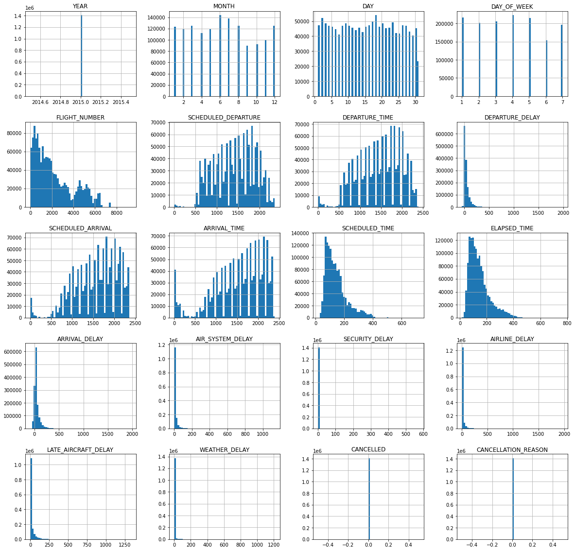
Viewing the ARRIVAL_DELAY, the histogram not only shows distribution but also the range. These values are mostly under 300 but the histogram shows the maximum at large numbers like 2000. This means that there are occurrences in which the delay reason had a delay time of about 2000.
Check these outliers to see if it they were plausible. Sometimes, flight delays can push departures and arrivals to the next day after their scheduled flight; these outliers are in fact, representative. However, eliminating these outliers is up to your discretion as these can skew your model’s predictions. However, the idea that these outliers can impact how long a delay may be true in some cases.
Now that your data is prepped, you can explore your data reliably. In Exploratory Data Analysis, you discover and learn more about your data. After all the preparation, you should already have a good feel for what data means and hopefully how they relate to one another.
We utilized univariate graphical data analysis in our data preparation to help us find outliers and verify them with histograms. Doing so lets us see the large delays that sometimes happen for airlines.
You can do further analysis for data science and analytics with EDA. Use heatmaps for correlation. Use bar charts and scatter plots to visualize the data in a comprehensive way. Review this data and ask critical questions to improve processes.
Consider the flight delay problem was a real-life problem and you’re a data scientist/analyst. You see a high correlation between long distance and an airline having a high occurrence rate of a certain delay reason, you can escalate this to reveal inefficiencies that can be further optimized.
We didn’t review step 5 in data preparation: Feature Engineering. That’s where data analytics/data science differs from machine and deep learning. We want to review our project’s goal and format our data in a training and testing dataset.
Designing your data to match your machine learning model is conceptual but fairly simple. With your project goal in mind, format your data in such a way that our machine-learning algorithms can do their best job. Assign the variables that will be fed to the model such as state, airline, departure location and destination, time of day, and day of the year (X-values) to predict an output: delayed flight reasoning (Y-value).
While Machine Learning and Deep Learning are not visual, the use of data as a prediction can be helpful. You can use multiple models to predict multiple things; predict the cause of the delayed flight and then predict the time of delay. The performance of your model is based solely on your data and the speed at which you can achieve these results is on the hardware. Take advantage of GPU acceleration to process data and train on the largest datasets.
Analytics and Data Science as well as Machine Learning and Deep Learning are workload intensive. Get results faster with the best hardware in your next Exxact Workstation or Server.
Talk to us today for more information!
Exploratory Data Analysis and Data Preparation are the most important tasks you need to do to ensure you get the best model. Your deep learning, machine learning, or data science projects start with preparation.
Like automotive painting, preparation is 80% of the job in getting the best results. Otherwise, our models will become inaccurate, fragmented, and overall lower quality than desired. The last 10-15% is polishing and fine-tuning to hone our models.
We will focus on exploring, understanding, and preparing your data to find underlying attributes, outliers and anomalies, and patterns and correlations before feeding it to your model.
Exploratory Data Analysis is a process used by data scientists and machine learning researchers to analyze, investigate, and understand the dataset using visualization tools. EDA can reveal patterns, relationships, correlations, as well as biases, outliers, and invalid data points to clean, prepare, and analyze data for feature engineering.
Exploratory Data Analysis and Data Preparation go hand in hand in our opinion. Yes, EDA can be a standalone method for discovering and understanding your data but can supplement your data preparation making it easier to clean your data. Use EDA during or after your Data Preparation step. Here is a short run down as to what to focus on when preparing your data.
Evaluating the problem and defining the goal of the model may sound trivial, but it is an essential process that is overlooked. You might have all this data but without the right questions to ask, there are no answers. A clear and well-defined object for the project directs the project for more informed decisions on data preparation, analysis, and feature engineering.
Say you wanted to determine flight delay reasoning based on time, departure location, arrival location, distance, airline, and other variables. If your goal is to have a very easy-to-digest model with clearly defined reasons as to why a flight might be delayed, you could opt for a binary decision tree.
If you want to just predict a new flight’s delayed reasoning, neural networks can deliver results in evaluating underlying relationships to provide a more accurate hypothesis. Neural Networks are the beating hearts of AI, but it is difficult to look under the hood as to why the model is choosing one weight over the other.
Of course, the best way to understand your data is to gather the data yourself but this is not always the case. Sometimes you receive the data as a freelance data analyst or you’re evaluating a dataset you found on Hugging Face to practice. Your expertise might not always be in that dataset, so receiving any guide as to how the data is organized is important.
Data is often organized in a table like a json or csv. Use tools like Pandas to view the table data frame and examine the data. Sometimes these columns might be named obscurely so find out what each variable represents. Feeling out the data and understanding what each column represents to your problem will drive you immediately to the next step.
Now that you have your goal and you understand your data, the next step is to manipulate your data to answer your overarching question. Data Cleaning and Preparation starts with a couple simple steps:
All data is important data but for intents and purposes, introducing variables that are not impactful to the model can skew it in an undesirable direction. When you train your model, you might have access to more data than when you collect data in real-time. Some variables can be irrelevant which can be removed to keep your data table clean, tidy, and purposeful.
Consider the previous example for Flights and we want to predict flight delay reasoning:
import pandas as pd
import numpy as pd

flights = pd.read_csv('flights_sampled.csv')
flights.columns

Index(['YEAR', 'MONTH', 'DAY', 'DAY_OF_WEEK', 'AIRLINE', 'FLIGHT_NUMBER',
       'TAIL_NUMBER', 'ORIGIN_AIRPORT', 'DESTINATION_AIRPORT',
       'SCHEDULED_DEPARTURE', 'DEPARTURE_TIME', 'DEPARTURE_DELAY', 'TAXI_OUT',
       'WHEELS_OFF', 'SCHEDULED_TIME', 'ELAPSED_TIME', 'AIR_TIME', 'DISTANCE',
       'WHEELS_ON', 'TAXI_IN', 'SCHEDULED_ARRIVAL', 'ARRIVAL_TIME',
       'ARRIVAL_DELAY', 'DIVERTED', 'CANCELLED', 'CANCELLATION_REASON',
       'AIR_SYSTEM_DELAY', 'SECURITY_DELAY', 'AIRLINE_DELAY',
       'LATE_AIRCRAFT_DELAY', 'WEATHER_DELAY'],
      dtype='object')
We won’t need variables that have nothing to do with the flight delay reason itself like WHEELS_ON, WHEELS_OFF, TAXI_IN, and TAXI_OUT. We can also determine some variables that you can omit since they are unneeded redundancy like AIR_TIME and TAIL_NUMBER. You can find this dataset here on Kaggle.
Missing values can be a result of input error. Check to see if the errors make a significant dent in your entire dataset. If there are minimal errors, you can save some time by just taking those data points out. If you see a recurring theme for these errors, this might be an underlying cause that needs to be addressed outside your project. It is best to feed our model the cleanest and most comprehensive data to prevent any unwanted outcomes.
When reading CSV file formats using Pandas, it shows as ‘NaN' meaning the field is empty. You may have to infer what these NaN cells represent: if Delay Time cells have NaN, then you can replace these values with 0 as there is no delay.
Don’t think that all outliers are bad. Outliers can sometimes be representative of the data. Verify if these outliers are plausible as well as evaluate whether it is or is not detrimental to your system. Visualization can aid in identifying outliers and histograms are a great way to map out the range of the data:
flights.hist(bins=60, figsize=(20,20))

array([[<AxesSubplot:title={'center':'YEAR'}>,
        <AxesSubplot:title={'center':'MONTH'}>,
        <AxesSubplot:title={'center':'DAY'}>,
        <AxesSubplot:title={'center':'DAY_OF_WEEK'}>],
       [<AxesSubplot:title={'center':'FLIGHT_NUMBER'}>,
        <AxesSubplot:title={'center':'SCHEDULED_DEPARTURE'}>,
        <AxesSubplot:title={'center':'DEPARTURE_TIME'}>,
        <AxesSubplot:title={'center':'DEPARTURE_DELAY'}>],
       [<AxesSubplot:title={'center':'SCHEDULED_ARRIVAL'}>,
        <AxesSubplot:title={'center':'ARRIVAL_TIME'}>,
        <AxesSubplot:title={'center':'SCHEDULED_TIME'}>,
        <AxesSubplot:title={'center':'ELAPSED_TIME'}>],
       [<AxesSubplot:title={'center':'ARRIVAL_DELAY'}>,
        <AxesSubplot:title={'center':'AIR_SYSTEM_DELAY'}>,
        <AxesSubplot:title={'center':'SECURITY_DELAY'}>,
        <AxesSubplot:title={'center':'AIRLINE_DELAY'}>],
       [<AxesSubplot:title={'center':'LATE_AIRCRAFT_DELAY'}>,
        <AxesSubplot:title={'center':'WEATHER_DELAY'}>,
        <AxesSubplot:title={'center':'CANCELLED'}>,
        <AxesSubplot:title={'center':'CANCELLATION_REASON'}>]],
      dtype=object)
Viewing the ARRIVAL_DELAY, the histogram not only shows distribution but also the range. These values are mostly under 300 but the histogram shows the maximum at large numbers like 2000. This means that there are occurrences in which the delay reason had a delay time of about 2000.
Check these outliers to see if it they were plausible. Sometimes, flight delays can push departures and arrivals to the next day after their scheduled flight; these outliers are in fact, representative. However, eliminating these outliers is up to your discretion as these can skew your model’s predictions. However, the idea that these outliers can impact how long a delay may be true in some cases.
Now that your data is prepped, you can explore your data reliably. In Exploratory Data Analysis, you discover and learn more about your data. After all the preparation, you should already have a good feel for what data means and hopefully how they relate to one another.
We utilized univariate graphical data analysis in our data preparation to help us find outliers and verify them with histograms. Doing so lets us see the large delays that sometimes happen for airlines.
You can do further analysis for data science and analytics with EDA. Use heatmaps for correlation. Use bar charts and scatter plots to visualize the data in a comprehensive way. Review this data and ask critical questions to improve processes.
Consider the flight delay problem was a real-life problem and you’re a data scientist/analyst. You see a high correlation between long distance and an airline having a high occurrence rate of a certain delay reason, you can escalate this to reveal inefficiencies that can be further optimized.
We didn’t review step 5 in data preparation: Feature Engineering. That’s where data analytics/data science differs from machine and deep learning. We want to review our project’s goal and format our data in a training and testing dataset.
Designing your data to match your machine learning model is conceptual but fairly simple. With your project goal in mind, format your data in such a way that our machine-learning algorithms can do their best job. Assign the variables that will be fed to the model such as state, airline, departure location and destination, time of day, and day of the year (X-values) to predict an output: delayed flight reasoning (Y-value).
While Machine Learning and Deep Learning are not visual, the use of data as a prediction can be helpful. You can use multiple models to predict multiple things; predict the cause of the delayed flight and then predict the time of delay. The performance of your model is based solely on your data and the speed at which you can achieve these results is on the hardware. Take advantage of GPU acceleration to process data and train on the largest datasets.
Analytics and Data Science as well as Machine Learning and Deep Learning are workload intensive. Get results faster with the best hardware in your next Exxact Workstation or Server.
Talk to us today for more information!
